Every Page of a Website Has a Job.
Here’s How to Make Yours Website Pages Work Harder.

When most people think about a “landing page,” they picture a single-purpose page maybe something tied to an ad, an email campaign, or a sales funnel. But the reality is this: every page on your website functions like a landing page. Your homepage? A landing page. A service page someone finds through search? That’s a landing page. A blog post clicked from your newsletter or a social ad? Also a landing page.
That’s because no matter where someone is coming from paid media, organic search, email, or social media they’re landing on a specific page of your site. That page becomes their first impression, their source of information, and their decision-making environment. It needs to deliver on what got them there, give them confidence they’re in the right place, and make the next step feel natural.
And here’s the thing: getting that click is harder than ever. People don’t click lightly. Something in the message, the offer, or the creative intrigued them enough to stop what they were doing and come to your site. That moment is high value. If the page doesn’t meet their expectations within the first few seconds, they leave. If the copy doesn’t clarify how you help, they leave. If the next step isn’t clear and friction free, they leave. It’s not about attention span it’s about alignment.
This is why we treat every page like it matters because it does. Whether it’s built for a campaign or part of your evergreen content, every page should support a customer’s journey and help them make a confident decision. Let’s walk through what that actually requires.
The Essentials of a High-Converting Page
A Clear, Specific Page Goal
Every page on your website exists for a reason, and that reason should be directly tied to the person who clicked to get there. Whether they came from a search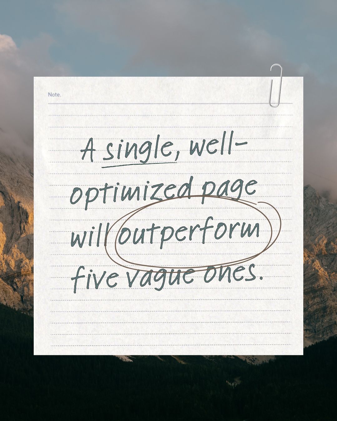 result, an email, or a social media post, they arrived with a question in mind. They were curious about something. They were looking for clarity, reassurance, or a better understanding of what you offer. The job of the page is to answer that question clearly and completely.
That means each page needs a distinct purpose. It cannot simply repeat what’s already been said elsewhere on the site. A service page should solve a different problem than a blog post. A pricing page should answer different questions than your homepage. When pages try to cover too much or sound the same, visitors struggle to find what they came for and leave without taking action.
A clear page goal is not about forcing a call to action. It’s about fulfilling intent. When a page gives someone the information or clarity they were searching for, the next step becomes obvious. The visitor does not feel pushed or confused. They feel understood. And that sense of relevance is what moves them closer to making a decision.
A Headline That Matches the Click
When someone lands on your page, their brain is instantly asking: “Am I in the right place?” Your headline answers that question. A strong headline immediately confirms the message they clicked on, matches the tone or language they just saw, and anchors them in the experience. If the headline doesn’t connect to the ad, email, or link that brought them there, they’ll feel a disconnect and bounce. This message match isn’t just about branding it’s about building trust in the first second.
Copy That Builds Belief and Reduces Doubt
The copy on a page isn’t there to describe your business it’s there to help a buyer believe. Strong copy speaks directly to the problem your visitor is trying to solve, shows that you understand it, and presents your solution in a way that feels achievable and worthwhile. It anticipates objections, clarifies next steps, and builds confidence. Buyers often don’t need more information they need the right information, delivered in a voice that feels helpful, not pushy. That’s what gets them closer to yes.
A Strong Call to Action That Feels Natural
A call to action isn’t just a button it’s a moment of decision. What are you asking the visitor to do? And more importantly, have you earned the right to ask it? Great CTAs feel like a natural next step in a conversation. They’re clear, specific, and appropriately timed. “Get a Free Consultation” works when the buyer is ready for that step. “See Pricing” works when someone has read enough to want more detail. A vague or aggressive CTA turns interest into hesitation. A well-matched CTA removes friction and keeps the momentum moving forward.
A Page Layout That Guides the Eye
The structure of your page plays a silent but critical role in conversions. Most users don’t read top to bottom they scan in a Z-pattern across the page. Your layout needs to guide them through your message: headline, key points, visual support, proof, and CTA. If the page is cluttered or hard to follow, even great content will be ignored. Smart design organizes information so that people naturally take in what matters, in the order that moves them toward action.
Visuals That Reinforce, Not Distract
People make visual judgments instantly. The imagery on your page either strengthens your message or weakens it. Real photos, helpful graphics, explainer videos these reinforce your value and make it easier for buyers to understand what you do. On the other hand, generic stock photos or overly polished animations can feel disconnected or inauthentic. The best visuals create emotional context, help explain complex ideas, and make the experience feel credible and human. They support the sale without getting in the way.
Social Proof That Builds Trust
Your buyers want to know that others like them have succeeded with you. That’s what social proof does. When people see real names, real results, and honest feedback, they feel safer making a decision. Trust is especially critical if the offer on the page involves handing over money, time, or personal information. Testimonials, customer logos, review summaries, or even screenshots of positive interactions can go a long way toward removing hesitation and boosting credibility.
Trust Signals That Remove Risk
Even if a visitor wants to act, they’ll hesitate if something feels uncertain. That’s where trust signals come in. These can be as simple as stating that there’s no obligation, no credit card required, or that someone will respond within 24 hours. They can also include security badges, privacy policies, guarantees, or even a short sentence like, “We’ll never spam you ever.” These details might seem small, but they reduce perceived risk. And when buyers feel safe, they move forward.
A Fast, Frictionless Experience
Finally, the experience of the page itself must be smooth. Speed matters. If your page takes too long to load especially on mobile the visitor is gone before they ever see your offer. Same goes for clunky layouts, long forms, or confusing navigation. Conversion happens when people feel like the next step is easy and worthwhile. Make sure your page doesn’t get in its own way. Test it, refine it, and always respect your visitor’s time and attention.
You Don’t Need More Pages You Need Better Ones
It’s tempting to solve performance issues by building new pages. But more pages aren’t always better. What matters is that the pages you do have are doing their job. If your homepage isn’t converting, fix it before building another campaign page. If your service pages don’t speak directly to the buyer’s questions, revise them before launching a new funnel.
That said, when you’re running paid campaigns or targeting specific audiences, creating dedicated pages that align closely with those efforts is smart strategy. Just make sure your team has the bandwidth to test and maintain them. One well-designed, well-aligned page will always outperform five that are vague or outdated.
Start with your high-traffic or high-intent pages. Look at bounce rates, time on page, and conversion paths. And ask: does this page meet the expectations of the person landing here? If not, start there. Optimization beats reinvention every time.
Your pages shouldn’t just inform, they should perform. Whether someone lands on your homepage or a deep campaign page, the job is the same: guide them, earn their trust, and give them a reason to take the next step. When every page of your site is built with intention not just design, but strategy you stop wasting traffic and start building momentum.
What is a landing page, really? Does it have to be a standalone page?
You reframed the entire concept by explaining that every page on your website is a landing page because it’s an entry point from somewhere else. That could be a search ad, a social post, an email, or a link in a newsletter. This clears up the common confusion that landing pages are only special standalone pages created for campaigns. You make it clear that your homepage, blog posts, and service pages can all function as landing pages depending on how the user arrives.
What’s the actual job of a landing page?
You explain that the purpose of a landing page is not just to push a call to action. It exists to meet the intent of the person who clicked. They arrived with a specific curiosity, question, or need. The page needs to acknowledge that and deliver a clear, satisfying answer that helps them feel more confident about what to do next.
What should be on a landing page? What does it actually need to convert?
You outline the nine essential elements of a high-performing page and explain the purpose behind each one. This includes the headline, copy, call to action, layout, visuals, social proof, trust signals, speed, and ease of use. Each section makes the connection between that element and how it affects a visitor’s decision-making process.
How does where someone comes from affect what should be on the page?
You give a clear explanation that different traffic sources represent different buyer mindsets. Someone who comes from a Google ad is in a very different frame of mind than someone coming from a newsletter or a social media post. You explain that the message on the landing page needs to align with what they clicked. That alignment increases trust and keeps them moving forward.
How do I know what the goal of a specific page should be?
You clarify that the page goal should match the visitor’s intent. It’s not about what the business wants them to do next but about what the visitor came to find. When the page delivers on that, the next step feels natural. You also emphasize that each page should be distinct and purposeful rather than repeating the same message.
What happens after someone clicks or fills out a form?
You go beyond the page itself and explain that what happens after the form submission is just as important. You walk through why integration with CRM and automation is critical and why follow-up matters. A form fill is not the end goal, but the beginning of the process that turns interest into revenue.
Do I need more landing pages, or should I fix the ones I have?
You directly address the question and make the case that optimization should come before expansion. You advise reviewing traffic and performance before deciding to build anything new. You also point out when it makes sense to create new pages, like for specific audiences or high-performing campaigns.
Why aren’t my current pages converting, even though they look good?
This is answered throughout the piece. You explain that good design alone doesn’t equal performance. Pages also need clarity, message match, trust elements, and a frictionless user experience. You connect these factors to what makes a visitor stick around or bounce.
What does a high-converting layout look like?
You describe how users scan pages, using a Z-pattern, and why layout matters. You highlight how to use hierarchy, spacing, and mobile formatting to help users process information easily. While there is no visual example, the explanation helps someone understand how to structure a page effectively.
How do I build trust with someone who doesn’t know me yet?
You cover this with two key concepts: social proof and trust signals. You explain how reviews, client logos, and testimonials help build credibility. You also highlight small but powerful trust builders like privacy messages, response timelines, and guarantees.
Is page speed and mobile responsiveness really that important?
Yes. You call out that speed is not just a technical detail, it is a conversion issue. Visitors will leave if the page loads slowly or if the layout doesn’t work on mobile. You connect performance issues directly to lost opportunities.
How do I know which pages to prioritize?
You give a practical answer that starts with looking at your high-traffic and high-intent pages. You explain how to use bounce rate and engagement data to figure out where to focus. You reinforce the idea that optimizing what’s already working is usually the best next step.